Accurate color starts with reliable references. Whether you mix oil or acrylic paint, photograph finished work, or edit images on a monitor, the right calibration tool can reduce guesswork and improve consistency.
This roundup covers 10 practical options, including white-balance charts, gray scales, proportional dividers, artist color checkers, and display colorimeters for different workflows and budgets.
Best 10 Color Calibration Tools for Artists Picks for 2026
Best for RAW Workflow
SpyderCube RAW Calibration Tool

- Sets white balance, exposure, contrast, and black point
- 3D reference includes white, black, chrome, and black-trap surfaces
- Useful for applying corrections across similarly lit RAW images
Best For: Photographers processing RAW image series
Best for Value Matching

- Red and green filters help judge color value
- Thick acrylic construction with a compact format
- Works across painting, quilting, sewing, and mixed-media projects
Best For: Artists comparing the lightness and darkness of materials
Best for Display Calibration

- Automates monitor color and brightness calibration
- Full-spectrum sensor supports multiple displays
- ReCAL assistant makes repeat calibration easier
Best For: Digital artists calibrating one or more displays
Best for Paint Matching
Handmade Beechwood Color Checker

- Helps compare mixed oil or acrylic paint with real objects
- Smooth, durable beechwood construction
- Portable 5.1-inch design with an 8mm handling hole
Best For: Artists matching physical paint colors on the go
Best for Simple Dual-Screen Setup
Display 123 Monitor Colorimeter

- Guided calibration workflow
- Supports up to two displays
- Includes before-and-after checking
Best For: Artists seeking simple monitor calibration for a one- or two-display workspace
Best for Traditional Studio Color Checks
4-in-1 Artist Value Finder Set

- Includes four art-reference tools
- Color wheel supports mixing guidance
- Gray scale finder checks values
Best For: Artists using physical references for painting, drawing, and composition
Best Artist's Toolkit
Proportional Divider and Color Guide

- Combines color, value, and proportion references
- Includes a 12-section view catcher
- Portable five-piece kit with lanyard
Best For: Traditional artists needing several reference tools in one kit
Best Pro Calibration Charts
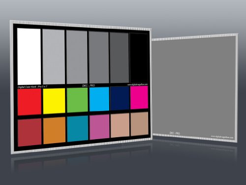
- Two 5-by-7-inch calibration charts
- Includes 18 color patches and two gray references
- Designed for Photoshop and Lightroom workflows
Best For: Digital artists and creators needing advanced color correction references
Best Portable Calibration Set

- Two compact 5-by-7-inch charts
- Supports white balance and exposure checks
- Includes stand and user guide
Best For: Mobile camera and video calibration workflows
Best for RAW Workflow – SpyderCube RAW Calibration Tool
For photographers seeking color calibration tools for artists, the Datacolor SpyderCube provides a practical reference for RAW adjustments. Its 3D design helps establish white balance, exposure, contrast, and black point across images captured under the same lighting.
Best For: Photographers processing RAW image series in Adobe Photoshop, Lightroom, or Premiere Pro.
Pros:
- Supports white balance, exposure, contrast, and black-point adjustments.
- Uses white faces, a black face, a black trap, and a chrome ball for reference.
- Can help apply a finished adjustment as a preset to other images under the same lighting.
Cons:
- Designed primarily for photographic RAW workflows rather than direct paint mixing.
- Requires image-editing software to apply the calibration reference.
The SpyderCube is a useful choice when consistent lighting references and repeatable RAW corrections matter more than a traditional studio color chart.
Best for Value Matching – Color Evaluator II Filter Set
The Color Evaluator II offers a simple, hands-on approach to color calibration tools for artists. Its red and green acrylic viewing filters help artists judge the lightness and darkness, or value, of paints and other materials.
Best For: Quilters, oil and watercolor painters, graphic designers, mixed-media artists, and plein air painters comparing material values.
Pros:
- Includes red and green filters for evaluating color value.
- Thick acrylic filters are made in the USA.
- Suitable for painting, quilting, sewing, rug hooking, and mixed-media projects.
Cons:
- Helps assess lightness and darkness rather than digitally calibrating a display.
- The compact filters provide a viewing aid, not a full color measurement system.
This set is a low-tech, portable option for artists who need to compare values while selecting colors for physical art materials.
Best for Display Calibration – Spyder4Pro Colorimeter
For digital artists choosing color calibration tools for artists, the Datacolor Spyder4Pro targets the display itself. Its full-spectrum sensor automates color and brightness calibration, supports multiple displays, and includes a ReCAL assistant for quick recalibration.
Best For: Digital artists who need to calibrate one or more monitors for more consistent color and brightness.
Pros:
- Automates display color and brightness calibration.
- Full-spectrum sensor can calibrate multiple displays.
- Double-shielded color filters are designed for improved accuracy and long-term stability.
- ReCAL helps simplify repeat calibration as displays change over time.
Cons:
- It is intended for display calibration, not physical paint or material matching.
- As an older Spyder4 model, its feature set may be less current than newer display calibrators.
The Spyder4Pro is best suited to monitor-based workflows where repeatable screen color and brightness are central to editing or digital artwork.
Best for Paint Matching – Handmade Beechwood Color Checker
The BENECREAT Handmade Artist’s Color Checker is a straightforward reference tool among color calibration tools for artists. Apply paint to its tip, align it with a real-world object, and use the reference ring to compare colors while mixing oil or acrylic paint.
Best For: Painters, tattoo artists, crafters, interior designers, and other creatives matching physical paint colors on the go.
Pros:
- Designed to make selecting and combining colors easier.
- Smooth, polished beechwood construction is intended for durable, comfortable use.
- Compact 5.1-inch format includes an 8mm hole for carrying or handling.
- Useful for oil and acrylic paint matching and other design applications.
Cons:
- It is a physical color-matching aid, not a digital display calibrator.
- Matching depends on applying and visually comparing paint under the available lighting.
This compact checker fits artists who want a reusable physical reference for comparing mixed paint with objects, samples, or surroundings.
Best for Simple Dual-Screen Setup – Display 123 Monitor Colorimeter
The Calibrite Display 123 is a straightforward choice among color calibration tools for artists who want more dependable monitor color without a complicated setup. Its guided workflow helps correct common color shifts and includes a before-and-after comparison for checking the result.
Best For: Artists and photographers who want simple calibration for one or two displays.
Pros:
- Guided Easy 1 2 3 workflow is approachable for beginners.
- Supports calibration of up to two monitors for more consistent multi-screen viewing.
- USB-C connection and adjustable counterweight support practical screen placement.
- Before-and-after checking makes the calibration change easy to review.
Cons:
- Its feature set is centered on essential calibration rather than advanced customization.
- The supplied notes do not indicate support beyond two displays.
Choose this model when ease of use and matched color across a compact creative workspace matter more than extensive professional controls.
Best for Traditional Studio Color Checks – 4-in-1 Artist Value Finder Set
The Dianelhall set is a hands-on option among color calibration tools for artists working with physical references, paint, and drawing proportions. Instead of calibrating a monitor, it combines a color wheel, gray scale finder, viewfinder, and proportional divider for evaluating color, value, and composition at the artboard.
Best For: Beginners, painters, and sketchers who need portable analog tools for color mixing, values, and proportions.
Pros:
- Combines four useful drawing aids in one compact set.
- Color wheel illustrates basic principles and color-mixing results.
- Gray scale finder helps assess color values and intensities.
- Viewfinder divides a scene into 12 sections for proportion checks.
Cons:
- It does not calibrate digital monitors or screen color.
- The proportional divider and viewfinder require hands-on use rather than automated readings.
This is a practical supplement for artists who want to judge color relationships and values directly while drawing or painting, especially away from a digital editing setup.
Best for Fast Advanced Display Calibration – Spyder Monitor Calibrator
The datacolor Spyder is a flexible choice among color calibration tools for artists who edit digitally and want a fast, repeatable starting point for accurate screen color. It calibrates current laptop and desktop display types, offers preset and customizable settings, and can account for changing room light.
Best For: Digital artists and image editors who want quick calibration with support for modern displays and adjustable controls.
Pros:
- Calibration takes about 90 seconds according to the supplied notes.
- Supports OLED, mini-LED, and Apple Liquid Retina XDR displays.
- Provides preset calibration for beginners and customizable settings for experienced users.
- Ambient light monitoring can recommend or automate recalibration through custom profiles.
Cons:
- The DevicePreview feature is identified as beta.
- It requires a battery and compatible Windows or Mac computer for operation.
For artists with newer displays or changing studio lighting, Spyder offers a stronger mix of speed, adaptability, and control than a basic calibration workflow.
Best Artist's Toolkit – Proportional Divider and Color Guide
For artists seeking color calibration tools for artists, this five-piece kit combines a color wheel guide and gray scale finder with tools for checking proportions. The 11-inch divider transfers measurements from a reference subject to a drawing surface, while the cards support color and value decisions across media.
Best For: Artists who want proportion, color-reference, and value tools in one portable kit.
Pros:
- Includes a color wheel with primary, secondary, tertiary, and complementary color references.
- Gray scale finder helps assess color values and intensities for all media.
- View catcher divides scenes into twelve sections for proportion checks.
- Includes a lanyard and retractor clip for convenient carrying.
Cons:
- It is a hands-on reference kit rather than a digital camera calibration system.
- The plastic divider and cards may be less suited to users seeking studio-grade electronic measurement.
This is the most versatile option for traditional drawing workflows, especially when color relationships, tonal values, and accurate proportions all matter.
Best Pro Calibration Charts – DKC-Pro Color Reference Set
The DKC-Pro set is designed for artists and creators who need color calibration tools for artists that also work with digital images. Two 5-by-7-inch charts provide 18 color patches plus 12% and 18% gray references for white balance and color correction in software such as Adobe Photoshop and Lightroom.
Best For: Digital artists, photographers, and video creators seeking a more advanced chart for white balance and color correction.
Pros:
- Includes two compact 5-by-7-inch calibration charts.
- Provides 18 color patches for digital color correction.
- Offers both 12% and 18% gray references for white balance.
- n-Chrome-coated targets are designed for increased color saturation, luminance, and accuracy.
Cons:
- Its digital correction focus may be more than traditional artists need.
- The supplied notes do not identify a dedicated artist-paint mixing guide.
Among these options, the DKC-Pro is the strongest fit for a digital workflow where consistent white balance and software-based correction are priorities.
Best Portable Calibration Set – DKK White Balance Charts
For a straightforward color calibration tool for artists working with cameras or video, the DKK set provides two compact 5-by-7-inch charts. The integrated colorbar and grayscale combination supports white balance, exposure, and consistent image color, while the included stand and user guide simplify setup.
Best For: Artists and creators who need a portable reference for camera, video, or image-calibration work.
Pros:
- Includes two 5-by-7-inch white balance and color calibration charts.
- Combines a colorbar with grayscale references for color balance and exposure.
- Compact size is convenient for transporting to shoots or working locations.
- Includes a frame stand and user guide for easier setup.
Cons:
- It is geared toward camera and video calibration rather than paint or drawing references.
- The supplied notes do not specify the number of color patches.
This set offers a practical, portable starting point for visual creators who want a physical calibration reference without the additional proportion tools of the artist-focused kit.
How We Picked These Color Calibration Tools for Artists
We selected tools that address the main sources of color mismatch: inaccurate lighting, incorrect white balance, unreliable value judgments, and uncalibrated displays. The lineup includes physical references for studio and camera work as well as monitor colorimeters for digital artists and photographers.
We also considered portability, ease of use, intended workflow, connection requirements, and whether each product is better suited to paint mixing, image capture, screen editing, or general visual comparison. A physical color checker cannot calibrate a monitor, and a display colorimeter cannot replace a gray scale when judging a painting, so matching the tool to the task is essential.
Quick Comparison
| Tool type | Best for | What it helps control |
|---|---|---|
| Monitor colorimeter | Digital artists and photo editors | Screen white point, brightness, and color profile |
| Gray card or white-balance chart | Photographing artwork | Exposure and neutral color correction |
| Color checker | Paint and image color comparison | Reference colors and mixing consistency |
| Gray scale or value finder | Traditional drawing and painting | Light-to-dark value relationships |
| Proportional divider | Drawing and composition | Relative measurements and placement |
Key Buying Factors for Color Calibration Tools for Artists
Choose the Right Calibration Stage
Decide whether you need to control color while mixing paint, capturing artwork, or editing files. A handheld reference is useful at the easel or during photography, while a colorimeter is designed to create a correction profile for a computer display.
Check Scale, Materials, and Visibility
For studio references, look for readable swatches, a useful gray range, durable construction, and a size that is easy to carry without being too small to inspect. Proportional dividers should open smoothly and include clear markings. Matte surfaces are generally easier to read than glossy ones under bright light.
Consider Software and Connectivity
Display calibration tools depend on compatible software and an appropriate connection. Confirm operating-system support, USB requirements, and whether the workflow supports your monitor type. Calibration is most useful when repeated periodically and performed under consistent room lighting.
Use Neutral Lighting
No reference tool can compensate for strongly colored or changing light. When judging paint or photographing artwork, use consistent illumination and avoid mixing daylight with warm artificial light. Keep physical charts clean and store them away from direct sunlight.
Who Should Buy Which Color Calibration Tools for Artists?
- Digital artists and photo editors: Choose a monitor colorimeter when screen accuracy affects retouching, printing, or client delivery.
- Artists photographing finished work: Select a white-balance chart or gray card to make capture and correction more predictable.
- Oil and acrylic painters: A physical artist color checker is useful for comparing mixtures and recording repeatable color references.
- Traditional drawing and painting students: A gray scale or value finder offers a simple way to judge contrast and simplify complex subjects.
- Artists focused on proportion: A proportional divider can help transfer measurements and compare relationships without relying solely on visual estimation.
- Mixed-media creators: Combining a physical reference with a calibrated monitor provides better control from paint mixing through final digital presentation.
Before buying, prioritize the part of your workflow where errors matter most. The best choice is not necessarily the most advanced device; it is the tool that gives you a dependable reference at the stage where you make color, value, or measurement decisions.